 Visual Framework
Visual Framework
Visual Framework
The footer is a component positioned at the bottom of a page that provides access to supporting navigation, brand identity, and regulatory information.
The footer marks the end of the page experience. It reinforces brand presence, helps users discover supporting links, and provides access to required legal and compliance information. While it complements primary navigation, it should not duplicate or replace core page content. Its structure and scale vary by context from modular configurations to simplified variations for focused experiences.
Use the footer when the page provides a complete experience and users may benefit from secondary navigation or supporting information.
Here are some cases where the footer provides value:
The footer should be omitted when:
| Variant | Examples | Description |
|---|---|---|
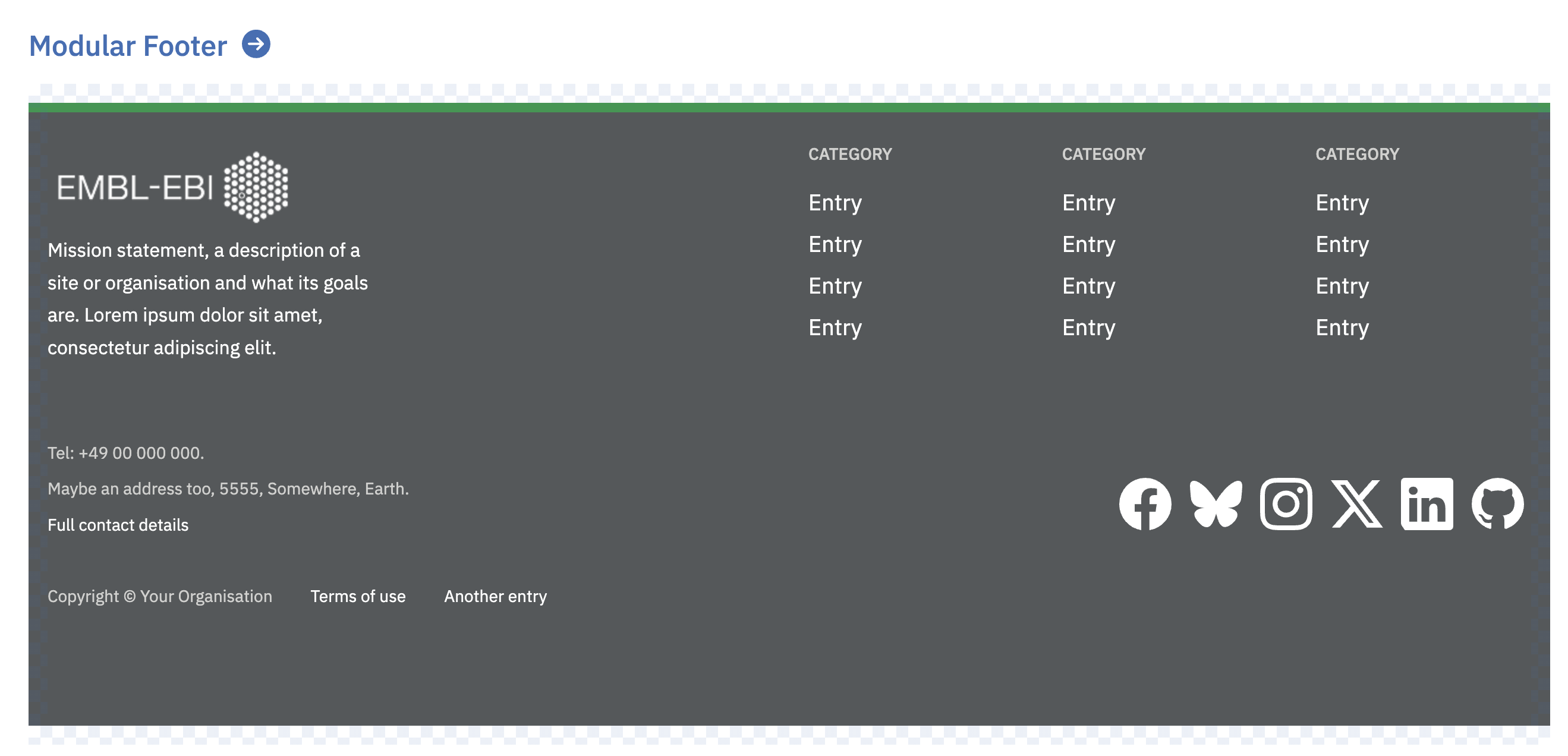
| Modular | VF-footer | Use when footer sections need to be customised |
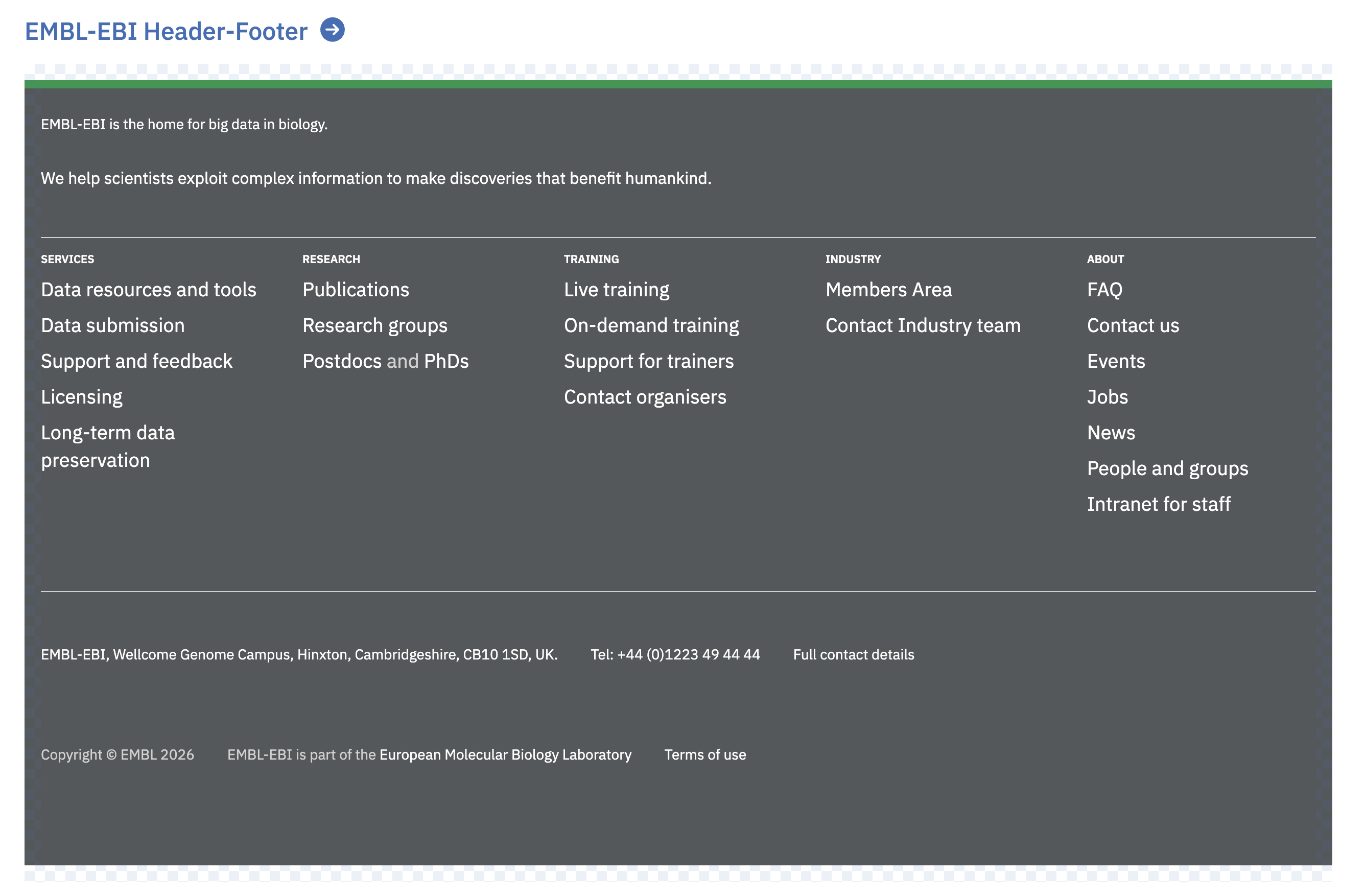
| EMBL-EBI Corporate Variant | EMBL_EBI header-footer | Use the EMBL-EBI corporate variant for organisational or self-contained experiences |
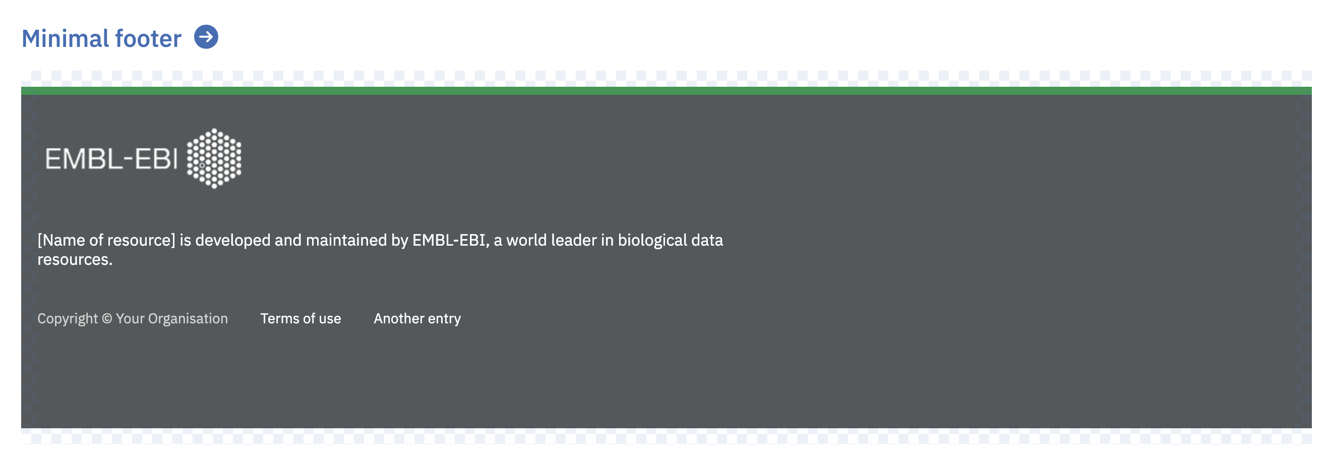
| Minimal | Use when only essential brand and legal information is needed |
The footer is available in two colour schemes: light and dark, to establish clear visual distinction from page content.
Apply the light scheme when the page background uses colour or tone, and the dark scheme when the background is white or near-white. This intentional contrast ensures users can clearly identify where the main content concludes and the footer begins.
Curate your footer. Footer links should direct users to relevant content that addresses common questions or needs. While disclaimers and legal content may be necessary, aim to keep them concise and avoid unnecessary clutter.
The footer does not need to mirror the header. Link organisation in the footer may differ from top-level header navigation, particularly when the header contains more extensive navigation options than the footer can accommodate.
The collaborations section provides standardised patterns for displaying varying levels of partnerships and collaborations. The display format adapts based on the number of collaborators.
This component targets WCAG 2.1 AA accessibility standard.
File system location: components/footer
Find an issue on this page? Propose a change or discuss it.
Are you sure you want to close the chat?
Your current conversation history will be permanently deleted.